Ultimate Tutorial about Button Size
Button size is a crucial element in UI design, impacting both the aesthetics and usability of your project. In this tutorial, we’ll explore the most common button sizes, how to choose the right one for your needs, and best practices for ensuring your buttons are both functional and visually appealing.
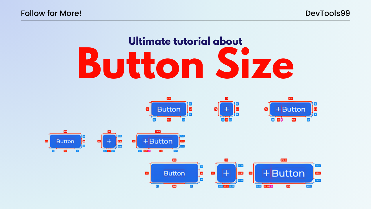
Choosing the Right Button Height
Button height can vary depending on the design and context. Below are the most common button height sizes:
- Small: 32px, 36px, 48px
- Medium: 40px, 44px
- Big: 52px, 56px
It’s essential to select one small, one medium, and one big button height to maintain consistency throughout your project. The choice depends on the project requirements and personal preferences. My approach varies depending on the specific needs of the project, but sticking to these standard sizes ensures a harmonious design.
Extending Buttons for Full Screen Width
Buttons can be extended to fill the full screen width, which is especially useful on mobile devices where screen real estate is limited. This technique is often employed for important actions like "Next" or "Submit" to make them more accessible and easier to tap.
For example, when designing a multi-step form, you might use a full-width "Next" button at the bottom of each step to guide the user through the process:
<button style="width: 100%;">Next Step →</button>Or, you can use full-width buttons for navigation actions on mobile, like this:
<button style="width: 100%;">← Back</button>
<button style="width: 100%;">Next →</button>
These full-width buttons are particularly effective on mobile devices, where the larger tap area enhances usability and ensures that the actions are clearly visible and easy to interact with.
Perfect Font Size for Buttons
The font size of the text inside a button is just as important as the button’s dimensions. A standard font size of 16px is widely recommended:
- Small Button: 14px
- Medium Button: 16px
- Big Button: 16px or 18px
I personally use a 16px font size for buttons to match the body text, ensuring a consistent look throughout the design. If your project uses a different font scale (like 11px, 13px, 15px, 17px), then consider using a 17px font size for your buttons.
Consistency in Font Scaling
It’s important to note that the font size doesn’t necessarily have to scale with the button size. For example, you can use a 16px font size for both medium and big buttons, which helps maintain consistency with the body text across the entire page. This approach ensures that all fonts on the page are aligned visually.
Padding Considerations
Padding around the button text is another key aspect of button design. While it’s good practice to adjust padding for visual balance, it can also add complexity to your design. It’s perfectly acceptable to keep the padding consistent across different button sizes to maintain simplicity and coherence in your UI.
Conclusion
Designing buttons is all about finding the right balance between aesthetics and usability. By selecting appropriate button heights, font sizes, and padding, you can create buttons that are not only visually appealing but also highly functional. Keep this guide handy as you design your buttons, and remember that consistency is key to a polished and professional look.
Follow Us:
Stay updated with our latest tips and tutorials by subscribing to our YouTube Channel.
